Responsive vs. Adaptive Design: What’s Best for You?
In today’s digital era, where users access websites on a wide range of devices smartphones, tablets, laptops, desktops, and even smart TVs it’s essential to build a website that functions seamlessly across all platforms.
User expectations have increased significantly, and so have the technical requirements for delivering a consistent, intuitive experience. That’s where the concepts of responsive design and adaptive design come into play.
While both aim to improve usability and performance across multiple screen sizes, they use fundamentally different strategies.
This article explores each approach in-depth, breaks down their unique advantages and limitations, and helps you decide which design methodology is best aligned with your business objectives, user needs, and budget constraints.
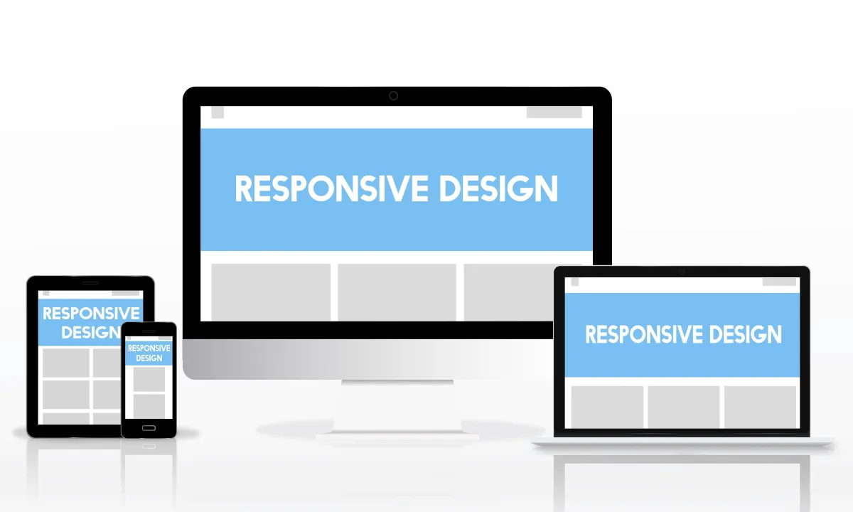
What is Responsive Design?
Responsive design is a flexible web development technique where a single layout is dynamically adjusted using CSS media queries. It automatically adapts the layout, images, navigation menus, and other content elements to the size of the user's screen. This technique eliminates the need to create separate designs for each device, simplifying both the development and maintenance process.
Key Characteristics:
Uses a single HTML codebase across all devices
Layout adjusts fluidly using relative units like percentages
Employs breakpoints in CSS to trigger layout changes
Benefits:
Efficiency: With one codebase, developers can manage updates and maintenance faster.
Scalability: Easily accommodates new screen sizes and devices as they emerge.
SEO-Friendly: Google recommends responsive design, which helps with mobile-first indexing.
Enhanced UX: Ensures a consistent and user-friendly experience across all devices.
How it Works:
Responsive sites use a combination of flexible grids, images, and CSS media queries. For example, a three-column desktop layout might become a single-column layout on a mobile device. The content remains the same, but its presentation changes to suit the screen size.
What is Adaptive Design?
Adaptive design takes a different approach. It involves designing several distinct layouts for specific screen sizes, typically based on six common widths (e.g., 320px, 480px, 768px, 1024px, 1280px, 1600px).
When a user visits the site, a script detects their screen size and loads the most appropriate layout.
Key Characteristics:
Multiple templates tailored to specific devices
Device or browser detection determines which layout to serve
Layouts do not resize dynamically—they switch between predefined options
Benefits:
Highly Customized UX: Allows for precise optimization of layout and interactions for specific devices.
Faster Loading: Serves only the assets needed for a particular layout, improving performance for known devices.
Granular Control: Designers can tweak experiences based on device capabilities or context.
Limitations:
Higher Maintenance: Requires updates and fixes across multiple layouts.
Device Limitation: New devices may not display optimally without updates.
Not Ideal for Unknown Devices: Performance and layout may suffer for screen sizes outside predefined options.
Which One is Right for You?
Choosing between responsive and adaptive design depends on your goals, resources, and user base. Here’s a guide to help you make that decision:
Choose Responsive Design If:
You’re launching a brand-new site or redesigning an outdated one
Your audience uses a wide variety of devices
You want a single, scalable solution that adapts over time
SEO and consistent mobile experience are key priorities
Choose Adaptive Design If:
You want to retrofit a desktop site with mobile support
Your users primarily use a small range of specific devices
You require custom interactions or design variations for different platforms
You have the budget and team to manage multiple codebases
Real-World Examples and Applications
Responsive Design: Best suited for general-purpose websites like blogs, e-commerce stores, and local service providers. At Strategic Web Designs' Web Design Services, we focus on responsive design to ensure fast-loading, high-converting sites across all platforms.
Adaptive Design: Ideal for complex enterprise systems, internal portals, or applications where the mobile and desktop experience must differ significantly. Examples include airline booking platforms or medical dashboards.
Combining Both: The RESS Model
Forward-thinking developers sometimes merge both approaches using RESS—Responsive Design with Server Side Components. In this model, the layout is responsive, but server-side logic serves device-specific assets like optimized images or JavaScript.
This hybrid approach allows for:
Better performance on mobile via optimized content delivery
Flexible layouts without sacrificing user experience
Easier scalability with performance benefits
SEO Considerations
When it comes to search engine optimization, responsive design is often the better choice. Here’s why:
Google’s algorithms prioritize mobile-first indexing
Single URLs simplify crawling and prevent duplicate content issues
Responsive sites reduce bounce rates due to better usability
Adaptive sites can still rank well, but developers must implement correct canonical tags, ensure consistent content across templates, and carefully monitor technical SEO.
For additional strategies, check out our Small Business SEO Tips.
Final Thoughts & Strategic Recommendation
At Strategic Web Designs, we typically recommend responsive design for most clients especially small and medium-sized businesses. It’s cost-effective, easy to manage, and future-proof. It supports a wide array of devices and ensures your site aligns with modern SEO standards.
However, if your project demands distinct designs for mobile and desktop, or if your audience primarily accesses your site from specific devices, adaptive design may be worth exploring.
Still unsure which is right for you? We invite you to schedule a free consultation to discuss your unique needs and goals.
FAQs: Responsive vs. Adaptive Design
1. Is responsive design better than adaptive for mobile users?
Generally, yes. Responsive design adjusts seamlessly to all screen sizes, offering a smoother mobile experience across more devices.
2. Does responsive design load slower than adaptive?
Not always. Performance depends on optimization practices, like lazy loading and image compression, more than layout strategy alone.
3. Can I build a site that uses both approaches?
Yes. The RESS approach blends responsive layouts with server-side logic to deliver tailored content efficiently.
4. Which is easier to maintain long-term?
Responsive design is typically easier since you only maintain one codebase rather than multiple versions.
5. Are there any risks with using adaptive design?
Yes. If not updated regularly, adaptive templates may fail to display correctly on new devices, and SEO may suffer if not properly configured.
